For this project we had to pick an object that we wanted to draw and then add shading by using different techniques with a pen. I chose to do a butterfly, this is because I love butterflies and lately I've been obsessed with them. The value technique that I used was circles. I used two different pens for different circle sizes. I also used some lines in some parts. Within my butterfly the left wing is my favorite part. This is because I love how it turned out in general. But I'm in love with the shading of it. Throughout creating my butterfly I learned that if you want to do a project with a bunch of small circles in it you need a lot of time. I also learned that it takes a lot of concentration to complete. One thing that I could still improve on is making sure that the shading blends better together.
0 Comments
For this project in art, we had to draw four murals to paint around our school. After we finished drawing and coloring them, we had to pick the two best. I chose the wolf one which I am wanting to put in an empty by the conference room or library. Then the history one I am wanting to put next to the history room. My main target with the placement of the wolf is for not only students to see but also the community, whenever they come into the school. With the history mural I am wanting pretty much just the students to see it. The spaces that I want to put my murals on are boring and have nothing going on with them. My design improves the space by adding some color to a plain white wall.
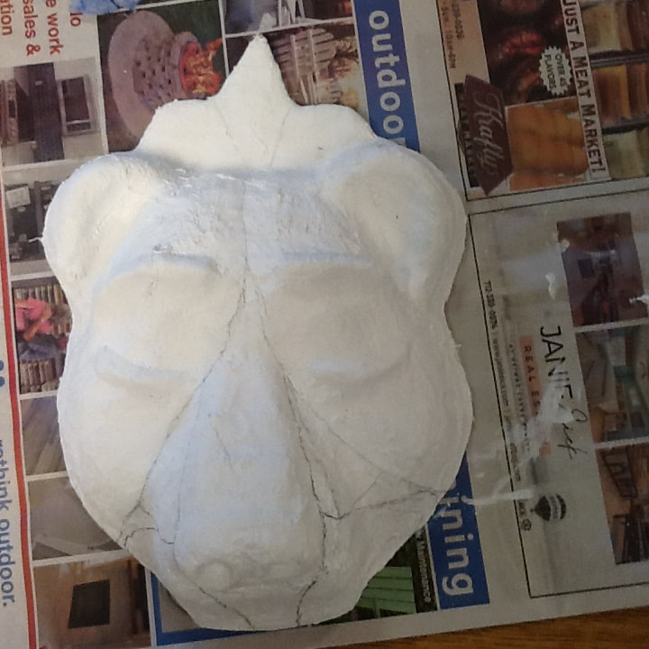
In class, we made to make masks. I chose a bear. The process of making the mask is you have to put plaster strips in water and then put it on the mask. Then you paint. A few challenges I faced while making the mask were the eyes. As well as trying to get the glass pieces right. I’m happy with the eyes because of all the colors. And I like glitter because it’s glitter. One thing I had to adapt to was I was going to do bubbles but then I couldn’t get the shape right so I forgot about it.
The way I used my own ideas in my artwork was I chose to draw a dino in the wall. As well as, a solar system in the floor and frog prints going across the lockers. First lets talk about the dinosaur in the wall. It is supposed to be like a portal type of thing to another world. This world being where the dinosaurs are at. Then we have the solar system coming through the floor. I love the stars and anything involving the sky so I wanted to add something personal into this drawing. Lastly, we have the frog prints running across the lockers, I asked Kiera what prints to do and she said do frog, therefore I did. I think that my drawing skills improved over the span of this project because I had no idea how to draw a hallway and know how to make it look like it's supposed to. Although I learned about the vanishing point, I also learned how important value is. The value is what took the longest, this is because you have to keep going over parts to get it darker and darker. One thing that I really focused on with this piece was the value. I was scared that I was going to make certain parts way too dark and then have to redo the section. There are two things that I am very pleased about within this artwork. I'm obsessed with the little dino peaking out of the wall, as well as, the solar system. I am happy with the dino because it doesn't make sense at all. I also just love it because I think it looks so cute with the little birds and the bubble clouds. I happy with the solar system because we have my two favorite "real" planets in there. As well as the sun and Earth. If you couldn't tell what the other two planets where, they are Saturn and Jupiter. I said real planets because my favorite planet is Pluto. Although I am happy with my artwork if I could do this project again I would probably do the value completely different. I think I would go lighter instead of darker. I would want to go lighter because I feel like it would have made my accent things pop more.
My art piece is bringing awareness to overdose in general, but specifically, opioid overdose. Since April, there has be 75,673 opioid overdoses. I chose this social issue because my stepdad passed away from a drug overdose. I wanted to show that even if they do have an addiction, it doesn’t define them as a person. I also wanted to show the comparison between what it feels like on the drug compared to how it looks to everyone else / the reality of it. I want you, as the viewer of my work, to think about what are you addicted to in your everyday life. How would you feel if someone started judging you because of your addiction? Most of the time these addictions steam from self-hate, so instead of adding to the hate, help.
For this project, we learned how to make baskets with yarn. One thing that I tried that I wasn't sure about was my color combinations. I wasn't sure if the muti-color yarn would look good with the solid color I chose for my rim. This was because the muti-color yarn had a mix of brown to tan to white to pink scheme going on while the solid color was a peachy tan color. After I got it all assembled together it looked better than I had imagined it to look. One thing that I would like people to take notice of while looking at my basket is the way my lines line up. I want people to notice this small detail because it took a lot of time to make sure they were all lined up correctly. One new technique that I learn in making my baskets is the way to wrap them. The way I was rapping it was completely backward from the way Kiera was wrapping hers. I was sticking the needle throw the back of the basket, while Kiera was sticking the needle throw the front of the basket. Her way was probably easier because my extra string kept getting stuck on the little knots, from where I was adding more yarn. I choose the muti-colored yarn because it was something different to try. I didn’t really have any expectations going into this project because I didn’t have any experience with it. Therefore I wanted to have fun with it. I also chose the muti-colored yarn that way I wouldn’t have to constantly change the color of the yarn. I also chose the solid color peachy tan color because it kinda matched the color scheme I had. Now that the basket is done, I am thankful. This is people who are doing the same motions over and over again. This caused my hands to hurt. My thumbs especially hurt. This was because I had to hold the rope in place and then wrap the yarn around the rope very tightly. The overall experience was all right. My hands hurt, but now I have a new skill. Also if I were to ever feel the need to make another basket I would know what to do and what not to do. One thing that I would like to change or improve on is the way the coils line up. I would have liked them to be a little straighter than they were. I'm not too sure what I am going to do with my basket. I may use it for my makeup brushes or I may give it to my mom.
For the next art piece, we did a chalk drawing. I chose an old dog, Chief. We had Chief while I was still living with my mom, my sister, and Vance. He was a Valentines' present for Layla and me. I chose to draw Chief because he represents an important part of my life. Another reason I chose him was that we don’t have many pictures of him unless we go onto Vance’s Facebook. The problem with that is sometimes it’s hard to back and look through the pictures. Some of the things that I learn while working on this piece was how a grid could really help while trying to draw something. I used a grid to first draw the outline of Chief. This helped me to see where I needed to start the lines and end them. I also helped so I could get the eyes, nose, and ears in the right spots. Another thing that I learned was that there is more than one kind of charcoal. There are actually many different kinds. We primarily used three. The first one we used was kinda lighter charcoal, then the second one was a darker one. This one helped us make the values differ. Lastly, we had the option to use pencils. One of the things that I found a little challenging was the little hairs all over. This is because it was very time-consuming. As well as being a very tedious detail. Although it is a very tedious process and very time-consuming, I worked very hard on the fur. I wanted it to look like actual fur so it’s a bunch of different lines instead of shading. Speaking of shading that was another thing I worked hard on. It took a while to get the shading and blending the way I wanted it to look. I did a lot of over-tracking and blending over and over again. Lastly, my favorite part of the piece would probably be the whole thing because I made it. I’m just joking I really like the right eye. I think it looks extremely good. I just simply love it.
For this artwork, we were told to search up landscapes that we may like to recreate. The style we were trying to achieve was like an impressionist. I chose two pictures with mountains in the background. I chose the one that made the prettiest sunset because I am a sucker for sunsets. I also added in some rocks extending all the way to the mountains. While working on this project I learned that if you use a paint brush with a smaller tip, you'll get finer lines and a bigger tip produces thicker lines. I also learned that it's pretty tricky to paint with water color if your paper is already really wet. This is because the water is causing the colors to bleed into each other. I also learned that if you want to do an impressionist art piece then you should give yourself plenty of time to complete it. This is because I missed some class periods so this is resulting in me not having enough time to finish. The left side looks like I let my eight year old brother get a hold of my work, while the right side looks like what I had envisioned for this piece. To talk a little bit more about the impressionist style and how I use it in my artwork, the impressionist style is taking an object and making an impression of it. It is not supposed to look exactly like the said object. Like I mentioned earlier, I used different sizes of brush to achieve the different sizes of lines on the right side. Then I also used the rounded brushes to make the dots on the mountain. The first thing that I am very pleased with about this art piece, I really like how the rocks turned out. I love the way I was able to shade them. I also like how they get lighter as well as getting smaller as they make their way to the mountains. I'm also very happy with my sky. I like the colors and I am super thrilled with the way the colors blended into each other. Lastly, I think that I could have improved on giving myself more time to complete this piece. I truly was rushing myself. I gave myself more to do than I could actually complete.
These past few weeks in art, we have been working on our Jim Dine artworks. Jim Dine is an artist who is most famous for his artworks involving; hearts, tools, and robes. For our project we had to pick an object that had a special meaning to us. For this, I chose my papa's angel. When I was eight, my papa passed away. He was my best friend in the entire world; because of this I missed him a lot. I decided one day to write a letter to heaven for him. Like a week later my grandma came to the house and gave me a package from "heaven". Inside this package there was a letter from "my papa" and this angel. I have had the angel ever since. I chose this object because it has been sitting in my room for about ten years. I wanted to do something with it. While working on this project I really enjoyed doing the black for details. This project is supposed to blend into the background with two different colors within your artwork. Then you were supposed to take the black and go around the object in places it was blending to much into the back ground. After I put the black in certain spots, you could tell there was an angel there. . Although the black was an exciting part, I did run into some challenging moments. I wasn’t getting the chalk to blend like I wanted it to, so I had to move on to another technique. The problem was that the blue that I was using wasn’t blending with the purpley-blue and gray that I was also using. The blue has a bumpy texture to it, while the gray and the purpley-blue were smooth. One thing that I did improve on was trusting my hand. I have learned that I can’t think about my art. I have to just go with the flow. I was trying to do a certain pattern throughout my artwork, but halfway through it wasn’t working out so I just had to go with it.
|